This article shows with example how to create a scatter plot in R programming languages. In this article, the ggplot2 R package is used for creating scatter plots.
What is Scatter Plot?
A scatterplot (also called scatterplot, scatter graph, scatter chart, scattergram, or scatter diagram) uses dots/points to represent values for two different numeric variables. It is used to observe relationship between two numerical variables. The relationship between variables is also called correlation. That means correlation is just another word for "relationship". Correlations may be positive (rising), negative (falling), or null (uncorrelated).
When the y variable tends to increase as the x variable increases (i.e. if the pattern of dots slopes from lower left to upper right), it indicates a positive correlation between the variables.
When the y variable tends to decrease as the x variable increases (i.e. if the pattern of dots slopes from upper left to lower right), it indicates a negative correlation between the variables.
When there is no clear relationship between the two variables, it means there is no correlation between the two variables.
The
ggplot2
Package
The ggplot2 Package is built for 'declaratively' creating graphics, which is developed based on "The Grammar of Graphics" book written by Wilkinson, 2005. You can use it for creating nice and professional looking graphs. However, you cannot create 3-dimensional graphics with ggplot2 package.
Creating the Scatter Plot
The following code snippets create a basic scatter plot using ggplot2 package.
ggplot(data = mpg) +
  geom_point(mapping = aes(x = displ, y = cty))

# ggplot(): a function to create a plot or graph
# data: a argument which take the dataset for creating the plot
# mpg: a dataset
# +: the + sign means to keep reading the code
# geom_point(): a geometry function to create the scatter plot
# mapping: a argument always paired with aes() function for mapping variables to axes
# aes(): a function specifies which variables to map to the x-axis and y-axis
# x: x-axis is assigned to displ (engine displacement, in litres) variable in mpg
# y: x-axis is assigned to cty (city miles per gallon) variable in mpg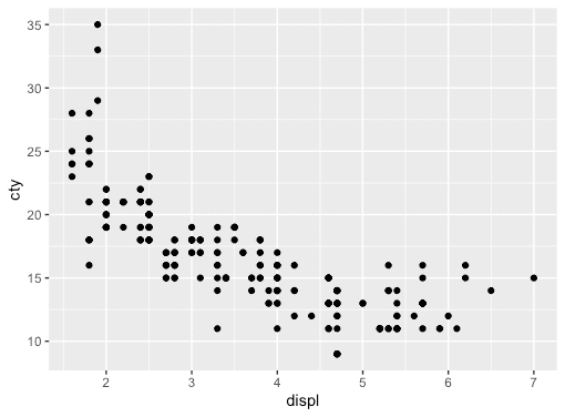
As you can see the relationship between displ and cty variables is negative.
Aesthetic Mappings
You can add a third variable to a 2-dimensional scatter plot by mapping it to an aesthetic using the aes() function. An aesthetic is a visual property of an object in the plot. For example, you can include aesthetic properties like size, shape, or color in your plot by adding a third variable like drv (type of drive train, where f = front-wheel drive, r = rear wheel drive, 4 = 4wd).
The following code snippets map the colors of the points in the plot to the drv variable to reveal the drive type of each car.
# Mapping color to drv variable
ggplot(data = mpg) +
  geom_point(mapping = aes(x = displ, y = cty, color = drv))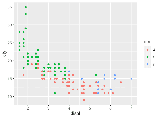
The following code snippets map the shapes of the points in the plot to the drv variable to reveal the drive type of each car.
# Mapping shape to drv variable
ggplot(data = mpg) +
  geom_point(mapping = aes(x = displ, y = cty, shape = drv))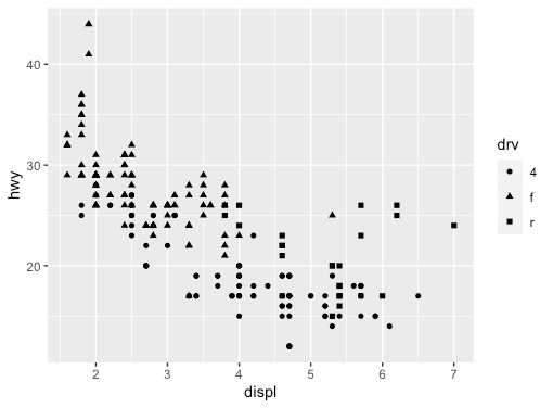
Facets
Categorical variables can be used to split the scatter plot into facets (i.e. subplots where each display one subset of the data).
The following code snippets split the plot into facets by using the drv variable.
ggplot(data = mpg) +
  geom_point(mapping = aes(x = displ, y = cty)) +
  facet_wrap(~ drv, nrow = 2)

# facet_wrap(): a function to facet the plot by a single (discrete) variable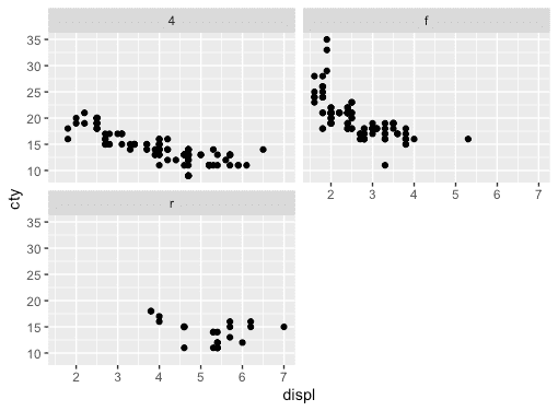
A combination of two variables can also be used to split the plot into facets.
The following code snippets split the plot into facets by using the drv and cyl variables separated by ~.
ggplot(data = mpg) +
  geom_point(mapping = aes(x = displ, y = cty)) +
  facet_grid(drv ~ cyl)

# facet_grid(): a function to facet the plot by a combination of two variables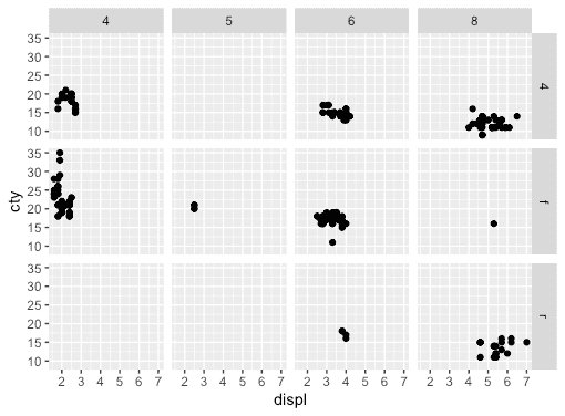
Ending note
Hope this will help you to create your scatter plots in R using the ggplot2 package. You can also create various types of graphs such as bar chart, box plot, and histogram using the ggplot2 package.
Happy R coding!
Comments
You are welcome to write comments, suggestions, corrections, or any queries related to the article. Your comments may take some time to be appeared. Please be aware that any irrelevant comments will be deleted. Thanks for your understanding, and your respectful & relevant comments!